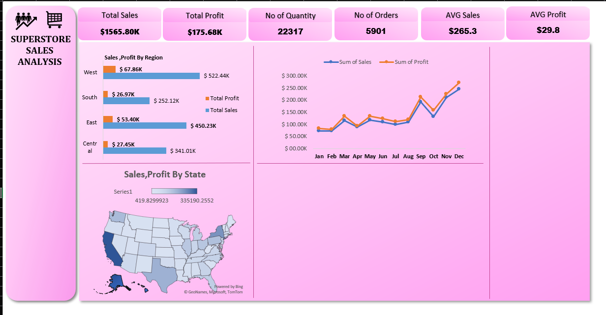
Project Overview
I used an open-source dataset to create a comprehensive sales report and dashboard. Initially, I posted the dashboard on Twitter and received valuable feedback from peers.
The Creation Process
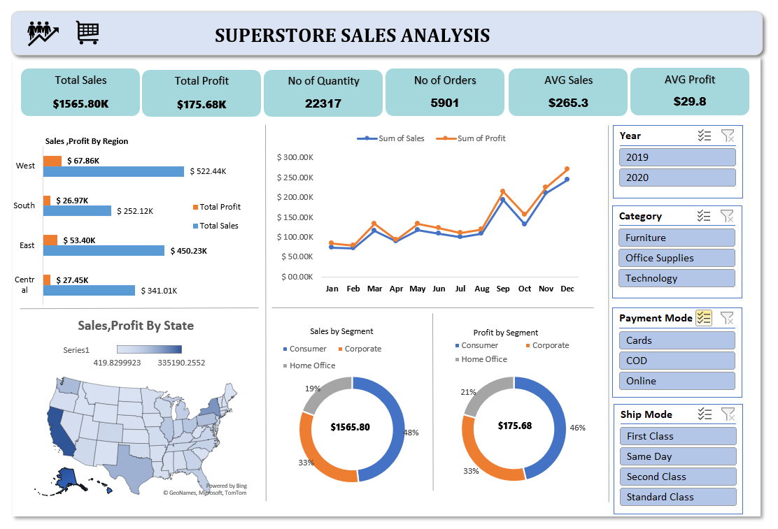
After sharing my initial dashboard on Twitter, I received valuable feedback from the community. Their suggestions helped me rethink certain elements. As a result, I revamped the entire dashboard by refining the color scheme and making design adjustments. This process not only improved the aesthetics but also enhanced the overall clarity of the visualizations. Special thanks to everyone who contributed their insights on Twitter!
Before and After Feedback
Challenges and Solutions
While creating the visuals, Excel initially wouldn't allow me to generate some charts directly from the pivot tables. I remembered facing this issue before, so I used the GETPIVOTDATA function to extract data from the pivot tables and then successfully created the necessary visualizations. This was a lesson learned from my previous experiences, which helped me resolve the issue quickly.
Key Learnings
This project allowed me to hone my skills in pivot tables, dynamic visuals, and dashboard interactivity. The feedback process also taught me the importance of continuously iterating on design for better clarity and user engagement.
Back to Portfolio